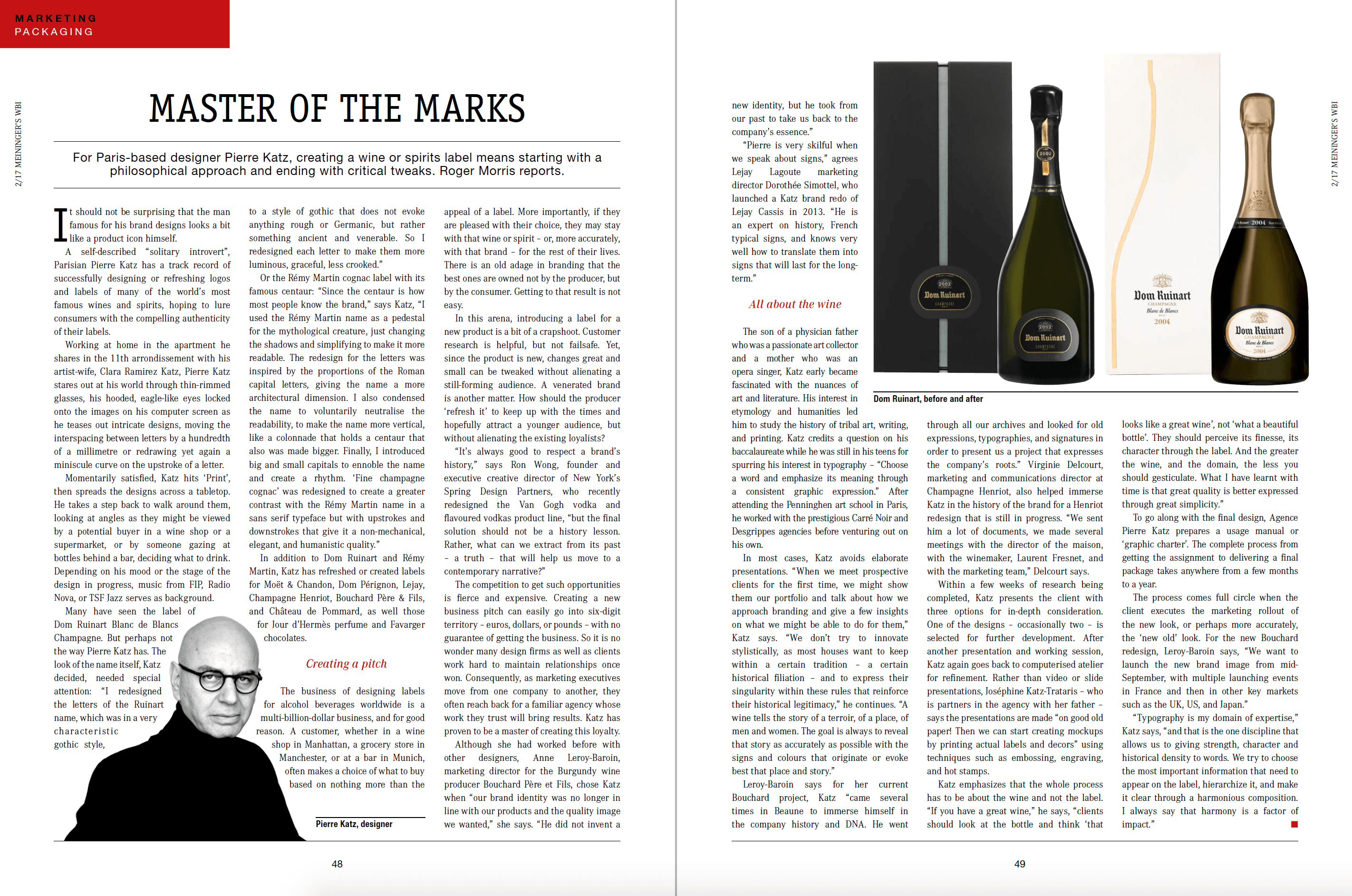
Wine Business International profiles Pierre Katz, and explains his cultural approach to brand signs and his perpetual quest for meaning and legitimacy in the logos and packagings he creates.
Katz emphasizes that the whole process has to be about the wine and not the label. “If you have a great wine,” he says, “clients should look at the bottle and think ‘that looks like a great wine’, not ‘what a beautiful bottle’. They should perceive its finesse, its character through the label. And the greater the wine, and the domain, the less you should gesticulate. What I have learnt with time is that great quality is better expressed through great simplicity.”
This approach, which consists in not disguising the brands he collaborates with according to his own style, is an approach which can be singular in the design world. It has more to do with craft. Pierre Katz is a designer, but approaches his creations with the humility of the artisan and not of the artist:
Anne Leroy-Baroin, marketing director for the Burgundy wine producer Bouchard Père et Fils, chose Katz when “our brand identity was no longer in line with our products and the quality image we wanted,” she says. “He did not invent a new identity, but he took from our past to take us back to the company’s essence.”
“Pierre is very skilful when we speak about signs,” agrees Lejay Lagoute marketing director Dorothée Simottel, who launched a Katz brand redo of Lejay Cassis in 2013. “He is an expert on history, French typical signs, and knows very well how to translate them into signs that will last for the longterm.”
To read more, find the article in the issue 02/2017 of Meininger’s Wine Business International :
https://www.meininger.de/en/wine-business-international/issue-022017