

Before/After
Founded in 2016 by Gregory Escure (Basic & More Festival) and Quentin Pernez (Compte Nickel), Cookoon is a service that allows you to organize all types of events by renting for a short time the home of a community member, accessible by cooptation.
In 2019, Cookoon extends its offer to a client base of companies and top managers to enable them to organize business meetings and corporate events in a unique and privileged setting.
Private mansions, big apartments, lofts, "hôtels particuliers" ... these places of prestige belong to members of Cookoon, offering the uniqueness, comfort and confidentiality necessary to professional events.
Beyond renting these exceptional places, Cookoon embodies a new generation in the French hospitality, with a range of experiential services: concierge, private chef, butler, sommelier, tools for meetings, flowers ...
To illustrate this new positioning, Cookoon has partnered with Pierre Katz to refine its brand identity.
The new logo evokes the great French tradition of hospitality and gastronomy while maintaining a very contemporary expression. The new symbol incorporates Cookoon's C, which contains a plume inspired by a Bodoni vignette. This form of plume evokes different ideas linked to the brand DNA: a chef's hat, a sparkle (fireworks, bouquet, party), a crown and a meeting point. The balance between tradition and contemporaneity is preserved thanks to these multiple evocations and a refined and abstract form.
The typography remains very simple in order to neutralize the particular morphology of the name and not to create a break with the original identity. It also allows to let the symbol shine. This new identity should allow Cookoon to establish itself as a reference in creating exceptional business and private experiences.


Before/After
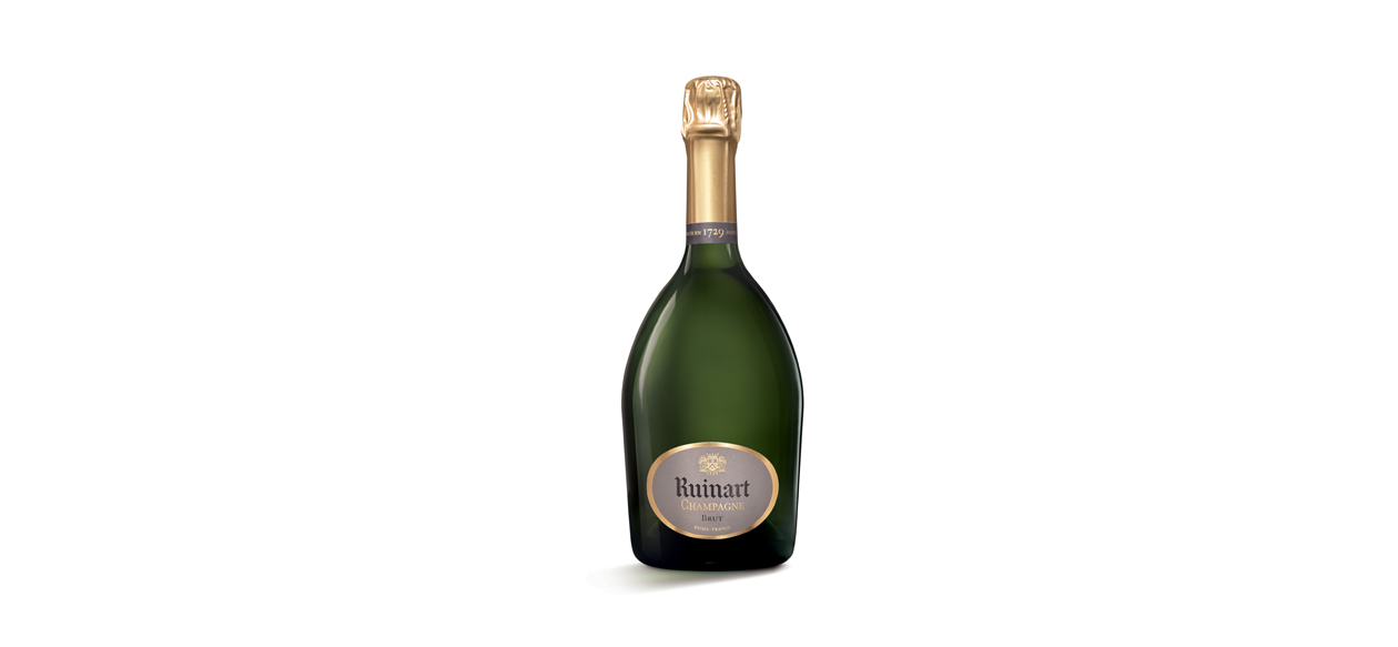
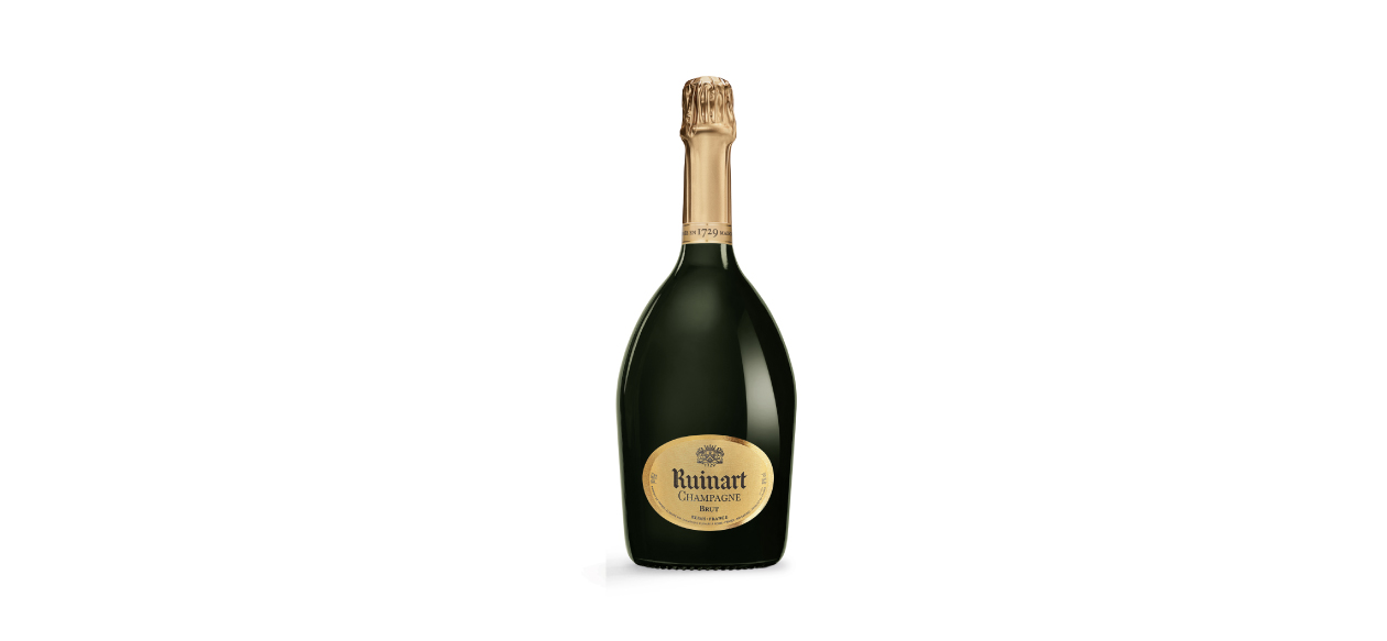
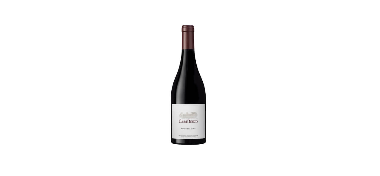
The shape of the label has been revised to flatter the singular shape of the bottle, and to introduce a filiation with the classic range, we took its rectangular shape as a starting point.
From there, we curved its sides giving an impression of "puffed out" chest, and a more corpulent look.
The name of the Cuvée Hemera is written in a script that evokes handwriting and the trace of man - evocations that reinforce the particular dimension of this prestigious vintage. In this same idea, the vintage now comes in red, and in a character reminiscent of numbered lot marking.
The color of the cap, a very white gold, has been warmed to gain in opulence and softness. The crest is embossed in the thick tin foil, which gives it a sensuous appearance.
The name Henriot that formerly appeared on the cap, was replaced by a more discreet monogram which now adorns the collar. The collar is thus no longer mute, as it is decorated with the monogram of the house and the name of the cuvée. Its shape was redesigned for a more contemporary "choker" silhouette, and its matte paper contrasts with the shine of the tin foil.
Before/After
Packaging identity. Before/after
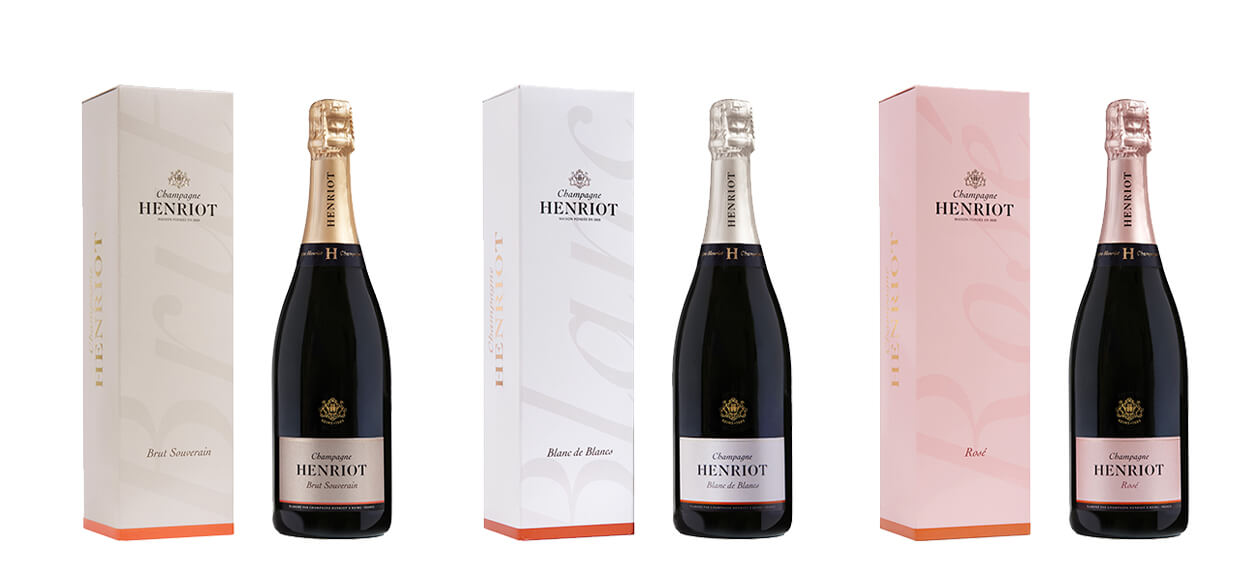
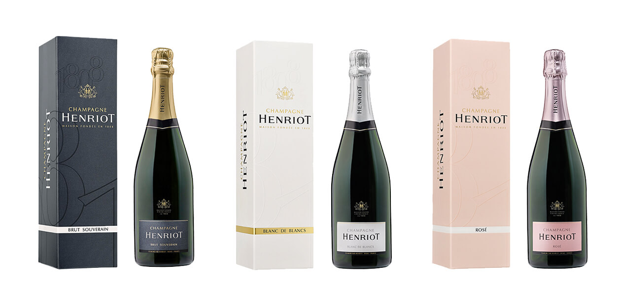
Champagne Henriot's classic range has been completely renovated to increase its perceived quality and to bring more status and culture to an iconic Champagne brand.
Through this renewal, we had to restore presence to the brand and return make it brighter.
Champagne Henriot's packaging was already quite singular in its form: the very minimalist label, close to a business card size, and the coat of arms in powdered gold on a transparent label gave the bottle a recognizable silhouette. We wanted to keep this silhouette, except for the cap that did not flatter the shape of the bottle, and we reviewed all the proportions, the quality of the signs and choice of colors.
The major change comes on the colors of the standard-bearer of the brand, the Brut Souverain. Previously dressed in a cold gray, urban and not qualitative, we sought to bring more "taste" to its packaging by significantly warming the gray which hue is now more natural. To introduce an element that brings energy, light and modernity to the whole, we have also introduced a brick-colored base that responds to the elegance and stability of gray. This brick tint, inspired by the house Les Aulnois owned by Champagne Henriot, also brings its light touch to other references.
The colors of the Rosé have also been revised, to evolve towards warmer, natural, less acid and chemical hues. The Blanc de Blancs also saw a change in the color of its cap which, if it still looks silvery, has been warmed with a little gold.
Finally, the cap and the collar have been revised to better accompany the shape of the bottle and make it more elegant. The black and straight collar protects the bottle like a choker and features the new chiseled monogram of the brand as a jewel. The collar is no longer silent.
Before/After
The graphics of the name have been made slightly taller and slimmer to create more height.
As the "B" acts as both the monogram and symbol of the group, it is now decorated with a discreet "fin" to make it more unique. This typical serif also gives the letter a more dynamic feel.
The square grey background of the original logo has been tilted and is now a stylized blue flag, which was given a sense of movement by the three open lines across its width. The blue color replaces the highly institutional feel of the grey, making it more human and giving the name a more welcoming look, a reflection of the group's will to communication more.

Before/After
As the "B" acts as both the monogram and symbol of the group, it is now decorated with a discreet "fin" to make it more unique.
This typical serif also gives the letter a more dynamic feel.
The square grey background of the original logo has been tilted and is now a stylized blue flag, which was given a sense of movement by the three open lines across its width. The blue color replaces the highly institutional feel of the grey, making it more human and giving the name a more welcoming look, a reflection of the group's will to communication more.
Before/After
In 2017, a monogram was added to the Maisons & Domaines Henriot logo, consisting of an H for the Henriot family and the letters M&D which make the H stronger.
Symbolically, the Maisons & Domaines arm is the strength behind the Henriot group, reinforcing its structure, while the pillars of the H, as if anchored in the ground, are reminiscent of foundations.
The graphic design of the name evokes an architectural pediment, with a typeface that is both human and robust.
Before/After
In the coat of arms of the House, the major change occurs at the location of the monogram: that of Apolline Henriot, founder of the house, now appears in the shield.
This typical nineteenth century monogram evokes a voluptuous and baroque opulence, and imparts a more authentic character to the emblem. The structuring frame of the emblem, the coat, has been redesigned to evoke the splendor of a chandelier or the shape of a lyre. The silhouette of the emblem now evokes an "Opera Garnier"Second Empire spirit, rather than a mounted piece. The greyhounds, noble animals symbols of loyalty and luck, have been redrawn from archive pieces of the house, to find a more adult and athletic character.
We added more "flesh" to the letter of the name Henriot and removed the big capitals on the H and the T which gave the whole a useless emphatic character. The base letter comes from a classic character, chosen for its corpulence and brilliance. The letter has been elongated and fattened for greater presence.
The word "Champagne" is now written in a script, which evokes the handwritten letter and the hand of man. It was necessary to give this word that qualifies the House and the quality of its wines a more expressive and personal dimension. It brings the word Champagne a more unctuous, sensual, brilliant silhouette, and adds a dimension of pleasure which was previously absent from it. We are now in the personal and authentic trace, the roundness of which evokes the gesture of the hand, the vital breath, and a rhythm, a movement, which contrasts with an immobile identity of commercial enterprise.
The mention "House founded in 1808" has been reworked in an extremely readable character with its micro-serifs (letter endings) that give it a very contemporary look without losing historical density.
Before/After
Packaging identity evolution. The 3 ranges.
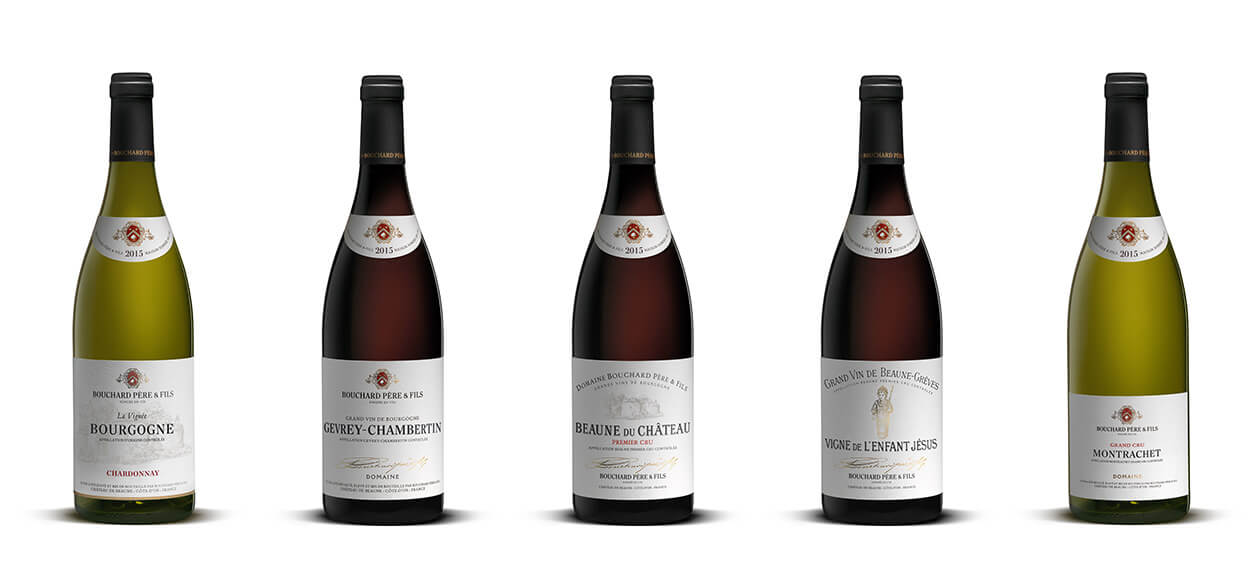
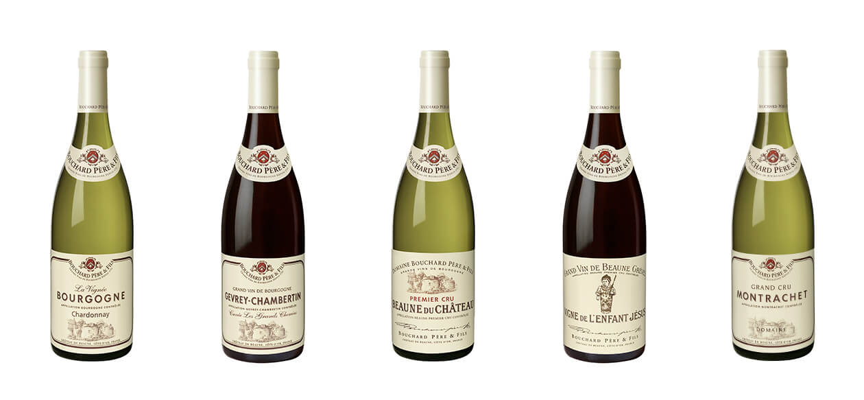
The packaging of Bouchard Père & Fils wines has been completely redesigned to significantly increase its perceived quality and instill a more cultural dimension.
The packaging, tending towards simplicity and elegance, is now part of a segmentation that clarifies and reinforces the quality of each range on the scale of crus. This new identity symbolizes not a transfiguration, but a return to the essence of Bouchard Père & Fils in its most contemporary expression.
The glossy cream-colored capsule has been replaced by a matte black capsule, which contrasts with the name Bouchard Père & Fils in matte gold foil. The black capsule neutralizes the bottle head and emphasizes the label and the collar.
The large format label, typical of Burgundy wines, has been preserved in its original size. A smaller and more discreet version was reserved for Icons.
We chose a natural and textured white paper that has the nobility of a book page, making each label the cover of a beautiful novel. The colors chosen to punctuate the architecture of the label follow the same inspiration: black, red and gold.
In order to create a coherent language, we introduced an exclusive typographic character to compose the appellations, which was inspired by the design of the Bouchard Père & Fils logo.
The accompanying typographies on the rest of the label were all chosen for their humanistic, sensitive and "intelligent" character. The mixture of different typographies aiming, with few signs, to give "taste" to the whole.
Finally, and despite all these transformations, we wanted to make sure that the faithful clients of Bouchard Père & Fils could still recognize these emblematic wines by far. The red spot of the coat-of-arms, appearing both on the label and on the collar, acts as a double "punctuation" and an effective signaling system that we have preserved.
The true shape of the Icons bottle is not represented here (Beaune Grèves Vigne de l'Enfant Jésus and Montrachet).
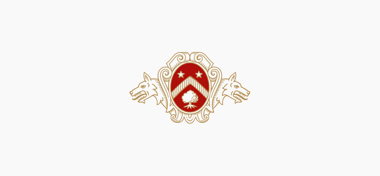
Before/After
The oval shape was redesigned so that its appearance suggests a cameo rather than an egg.
The oak tree symbolizes power and posterity and was redesigned to make its foliage and roots more harmonious.
The red coloring was made denser, warmer and darker to create a sense of depth and grandeur.
Before, the mantle looked either like an old parchment or the hide of a dead animal. Our aim was to give the coat of arms a less rustic and aggressive appearance, making it more architectural, so that it acts as a kind of pediment with soft, curved and welcoming shapes.
The wolves have been given a more heraldic and less naturalistic appearance. Originally displaying an aggressive posture (ears flattened, eyes narrowed), they now stand on guard (ears straightened, eyes open). We included the furry upper chest of the wolves to replace the two cut-off heads, giving them the role of guardians rather than hunting trophies.
The Bouchard Père & Fils name was completely redesigned from an archive typeface, from which we took the A with its diamond point crossbar, and the unique ampersand (& sign) with its characteristic little beak.
Before/After
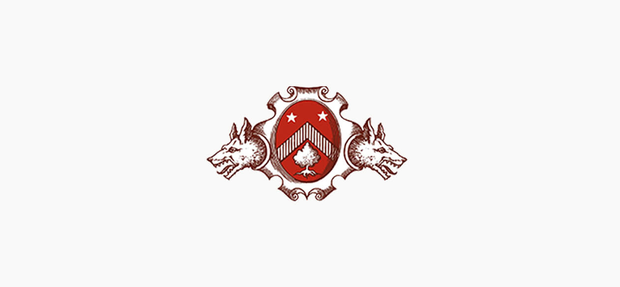
The oval shape was redesigned so that its appearance suggests a cameo rather than an egg.
The oak tree symbolizes power and posterity and was redesigned to make its foliage and roots more harmonious.
The red coloring was made denser, warmer and darker to create a sense of depth and grandeur.
Before, the mantle looked either like an old parchment or the hide of a dead animal. Our aim was to give the coat of arms a less rustic and aggressive appearance, making it more architectural, so that it acts as a kind of pediment with soft, curved and welcoming shapes.
The wolves have been given a more heraldic and less naturalistic appearance. Originally displaying an aggressive posture (ears flattened, eyes narrowed), they now stand on guard (ears straightened, eyes open). We included the furry upper chest of the wolves to replace the two cut-off heads, giving them the role of guardians rather than hunting trophies.
Before/After
The name Ecart, encircled in black, had the look of a stamp or signature from the Viennese Secession - a very singular dimension that we wanted to accentuate.
The name has been completely redesigned, its proportions revised to better occupy the space of its frame.
The location "Paris" needed to be replaced by "International", so we took this opportunity to redefine the typography of the base, to make it more consistent with the signature Ecart. The character was designed with an inspiration from the typical geometry of Art Deco, a movement that has deeply inspired Madame Putman, and whose origin meets the spirit of the stamp.
Before/After
For the launch of the first fragrance of Azzedine Alaïa, the iconic couturier, Mr. Alaïa asked Pierre Katz to rework the graphic design of his name.
Because the form and structure of the Alaïa name was already so beautiful, and the graphics conveyed a superb sense of elegance, Pierre decided to simply add some elevation to the name, slightly adjusting the typeface to give it height.
The word Paris was completely remodeled to make it more discreet and leave Alaïa centre stage.

Before/After
The original lettering was very effective at conveying the personality of the brand. The challenge was to make it look contemporary while retaining its historic typeface.
The letters were redesigned with greater tension, new spacing and careful use of weight. The new horizontal signature ensures the design elements have great presence, even in small formats.


Before/After
Particular attention was paid to detail: the cap features an embossed coat of arms, while the label is adorned with hot gilding and swelling varnish for added opulence. The mix of different typefaces contributes to the expression of rich taste.
The volume of the box has been streamlined with a side opening and an elegant Parisian fastening system.
Both boxes feature the same colors as the label and a broad outline, the graphic expression of the bottle.
The entire range has been redesigned: the different bottle formats, boxes, cases and bags.


Before/After
We took a jay from an old engraving and redrew it, perched on a branch.
The bird sits above the brand name which is designed in a typeface typical of the 19th century, its serifs evoking the claws of the little bird. The jay is a playful reference to the brand (Lejay) and a symbol of the natural world.
It has replaced the cryptic symbol of the "legendary monk" who was originally depicted on the liqueur and crème bottles. This little-known monk was in fact a reference to Abbot Bailly de Montaran who wrote The Admirable Properties of the Blackcurrant in 1712, an essay which may have inspired Auguste-Denis Lagoute to create his famous crème de cassis.
Before/After
Our mission with revamping the Lejay brand was to turn this regional fruit liqueur brand into an international cocktail ingredient.
We took a jay from an old engraving and redrew it in a natural setting, perched on a branch. The bird sits above the brand name, and the serifs of its 19th-century lettering evoke the claws of the bird's feet. The jay is also a playful reference to the brand (Lejay) and a symbol of the natural world.
Before/After
Until the logo was redesigned, the brand identity used a script suggesting the signature of the chocolatier, an artisan tone faithful to the family ethos of the company.
The brand wanted to start a new phase of expansion and establish its reputation as an international company. We therefore created a logo for it which would convey its status as a benchmark product in Geneva, the capital of luxury.
We produced an emblem designed from the coat of arms of Geneva, and made the logo symmetrical and highly formal, evoking the authority of the great Swiss watchmakers.
The original wording "chocolats et cacaos" [chocolates and cocoas] was reintroduced to underline the fact that the firm still roasts its own cocoa beans.
Before/After
The Metropole Hanoi is an hotel built in a traditional French colonial and Art Déco style, a style that is mirrored in the lettering chosen, which is typical for the 1930s.
The logo is built from the existing monogram, that has been redesign and "enlightened" through a thin incision in the letter.


Before/After
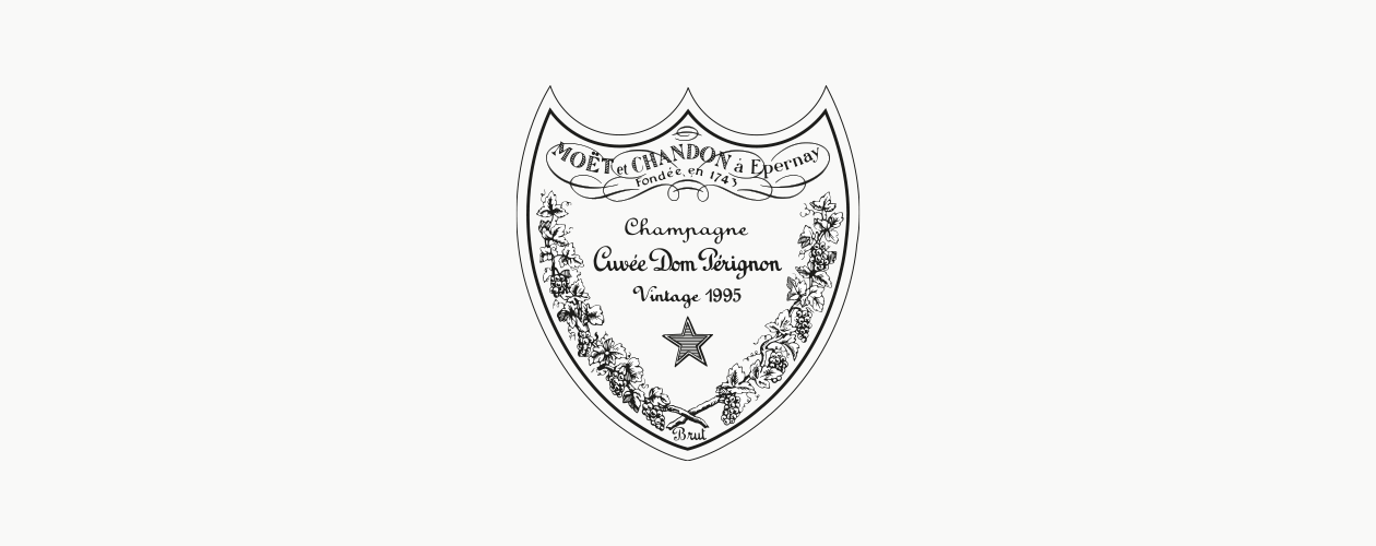
Changes were made in two phases, with the gradual disappearance of the name Moët & Chandon from the top of the label.
The different typefaces were streamlined. The vine branches and the star were meticulously redesigned.
The wording "Moët et Chandon" was removed from the top of the label. This area now contains the name of the monk who supposedly invented champagne, followed by the date he took up his post at Hautvillers Abbey.
Before/After
The house of Thierry Mugler asked Pierre Katz to straighten the signature of the brand to make it more legible and easier to use on different formats.
The design of the logo was therefore stretched and streamlined to fit into a standard horizontal space.
The incisive style of the lettering, based on the designer's signature, lost none of its vivacity but the layout was given greater balance and durability.
Before/After
The evolution of the brand shows the introduction of red, a colorful pulsation that symbolizes the brand's baseline: "the heart of Cognac".
Instead of a very nineteenth-century lettering, we drew a Roman capital that matches the centaur, a figure from Western mythology. The typography is here punctuated like a colonnade supporting the emblem.
Before/After
We conducted an audit of the design elements and completely revamped the brand identity, working on the architecture of the range, new launches and expressions of the brand in communication and retail.
The Moët & Chandon emblem is a combination of the Imperial crown and papal tiara. It was redesigned, as was the lettering, which now featured heavier downstrokes and upstrokes for a more harmonious effect.