Bouchard Père et Fils
Packaging renovation. The 3 ranges.
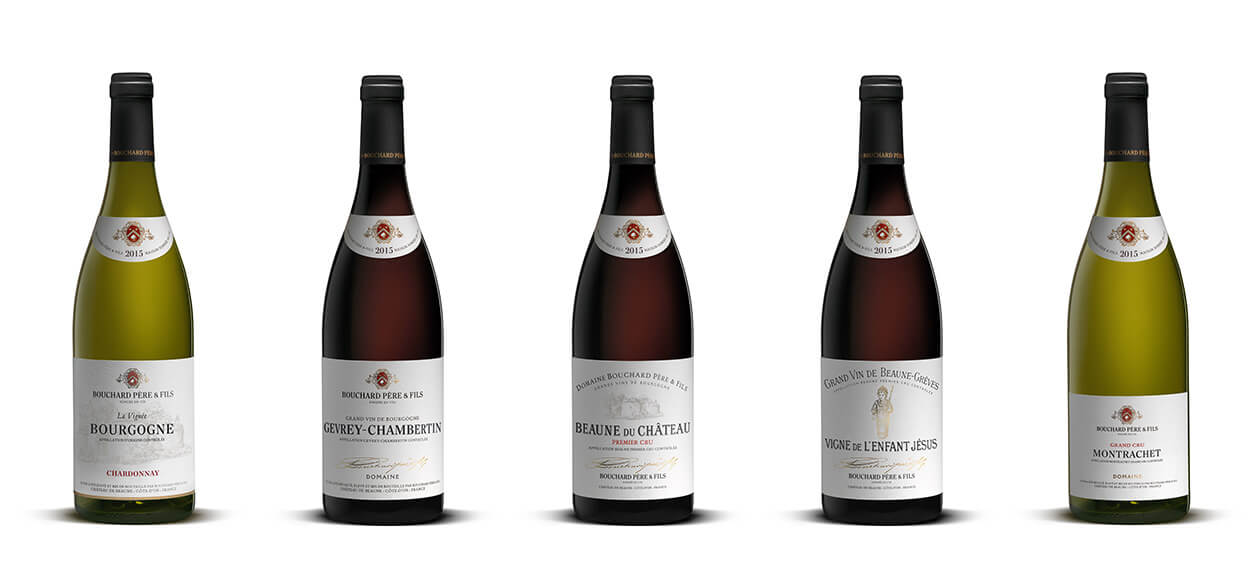
The packaging of Bouchard Père & Fils wines has been completely redesigned to significantly increase its perceived quality and instill a more cultural dimension.
The packaging, tending towards simplicity and elegance, is now part of a segmentation that clarifies and reinforces the quality of each range on the scale of crus. This new identity symbolizes not a transfiguration, but a return to the essence of Bouchard Père & Fils in its most contemporary expression.
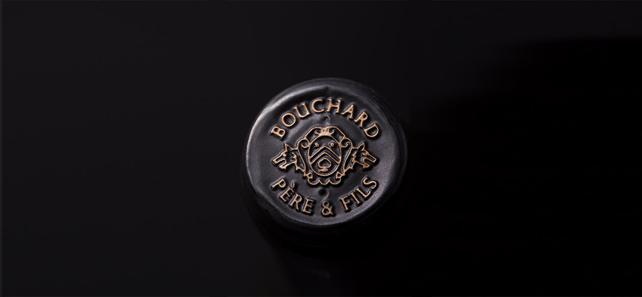
The glossy cream-colored capsule has been replaced by a matte black capsule, which contrasts with the name Bouchard Père & Fils in matte gold foil. The black capsule neutralizes the bottle head and emphasizes the label and the collar.
The large format label, typical of Burgundy wines, has been preserved in its original size. A smaller and more discreet version was reserved for Icons.
We chose a natural and textured white paper that has the nobility of a book page, making each label the cover of a beautiful novel. The colors chosen to punctuate the architecture of the label follow the same inspiration: black, red and gold.
In order to create a coherent language, we introduced an exclusive typographic character to compose the appellations, which was inspired by the design of the Bouchard Père & Fils logo. The accompanying typographies on the rest of the label were all chosen for their humanistic, sensitive and "intelligent" character. The mixture of different typographies aiming, with few signs, to give "taste" to the whole.
Finally, and despite all these transformations, we wanted to make sure that the faithful clients of Bouchard Père & Fils could still recognize these emblematic wines by far. The red spot of the coat-of-arms, appearing both on the label and on the collar, acts as a double "punctuation" and an effective signaling system that we have preserved.
Bouchard Père et Fils
Packaging renovation. The collar.
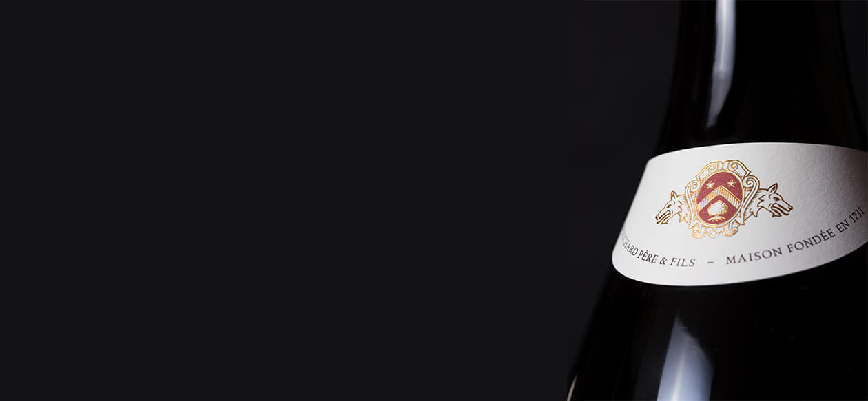
The singular shape of the crescent collar has long been part of the identity of Bouchard's packaging.
It has been reduced and redesigned to adorn the neck of the bottle like a choker.
Bouchard Père et Fils
Packaging renovation. The top of the capsule.
On the top of the matte black capsule, the Bouchard Père & Fils coat of arms has been simplified so that it can be reproduced in embossing and remain as legible as possible.

Bouchard Père et Fils
Packaging renovation. The Discoveries collection.
The Discoveries collection is one for initiation, and brings together the most accessible wines of the House.
The label therefore had to be a true wine identity card, containing all the information and signs of reassurance required by connoisseurs and neophyte amateurs alike.
The filigree illustration of the Beaune castle, owned by Bouchard Père & Fils, which previously adorned all of the Maison's wines, has been redesigned and reserved exclusively for the Discoveries collection.
We have also introduced a gold strip at the base of the label, which is both an attractive graphic element and symbolically evokes the terroir.
The red color, which function is to emphasize an important element, is used on the Discoveries to underline the grape variety which constitutes an important element of identification on these accessible ranges.
Bouchard Père et Fils
Packaging renovation. The Treasures collection.
The Treasures collection represents the richness of the Burgundy climates and brings together all the Villages and Premiers Crus of the Côte de Nuits and the Côte de Beaune as well as the Premiers Crus of the Côte Chalonnaise.
For this beautiful collection, we have introduced a historic signature Bouchard Père & Fils that comes in gold to certify the label. The label has been simplified to give more room to the appellation - the labels thus become more and more refined as we climb the scale of the Crus.
The Discoveries are made to be visually appealing, and the collections of the Treasures and Icons are becoming more and more discreet to let their prestigious appellations speak for themselves.

Bouchard Père et Fils
Packaging renovation. Details from the Nuits-Saint-Georges label.

Bouchard Père et Fils
Packaging renovation. The Icons collection.
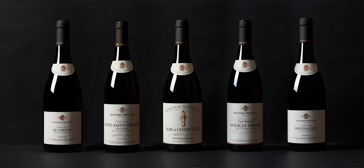
The most extraordinary and iconic wines of the House are gathered in the Icons collection.
To further differentiate the extraordinary wines that make up the Icons, we have chosen a specific bottle silhouette: this bottle, whose plumpness reflects a generous and venerable character, is dressed with a label whose dimensions have been reduced.
The signs that make up the label that we wanted less "talkative" were also reduced, in order to give primacy to its great names.
Bouchard Père et Fils
Packaging renovation. The historical singularities.
Beaune Grèves Vigne de l'Enfant Jésus and Beaune du Château are two standard bearers of Bouchard Père & Fils, and among the oldest appellations of the House.
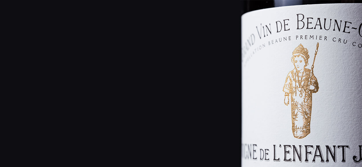
Historically, the composition of their labels has always been distinguished from other wines, so it was important to keep the structure of these classic labels, as well as the original typography used for the appellations.
Bouchard Père et Fils
Packaging renovation. Details from the Beaune Grèves Vigne de l'Enfant Jésus label.
The illustration of the Christ Child has been redesigned for more readability and elegance.
Bouchard Père et Fils
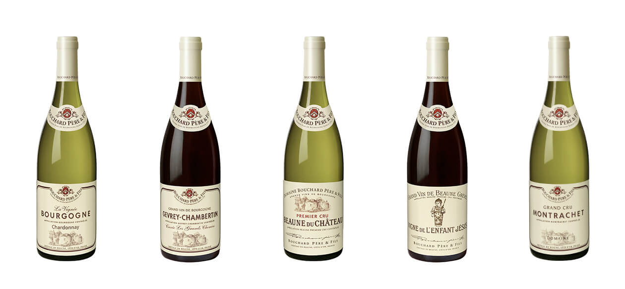
Packaging identity evolution. The 3 ranges.
The packaging of Bouchard Père & Fils wines has been completely redesigned to significantly increase its perceived quality and instill a more cultural dimension.
The packaging, tending towards simplicity and elegance, is now part of a segmentation that clarifies and reinforces the quality of each range on the scale of crus. This new identity symbolizes not a transfiguration, but a return to the essence of Bouchard Père & Fils in its most contemporary expression.
The glossy cream-colored capsule has been replaced by a matte black capsule, which contrasts with the name Bouchard Père & Fils in matte gold foil. The black capsule neutralizes the bottle head and emphasizes the label and the collar.
The large format label, typical of Burgundy wines, has been preserved in its original size. A smaller and more discreet version was reserved for Icons.
We chose a natural and textured white paper that has the nobility of a book page, making each label the cover of a beautiful novel. The colors chosen to punctuate the architecture of the label follow the same inspiration: black, red and gold.
In order to create a coherent language, we introduced an exclusive typographic character to compose the appellations, which was inspired by the design of the Bouchard Père & Fils logo.
The accompanying typographies on the rest of the label were all chosen for their humanistic, sensitive and "intelligent" character. The mixture of different typographies aiming, with few signs, to give "taste" to the whole.
Finally, and despite all these transformations, we wanted to make sure that the faithful clients of Bouchard Père & Fils could still recognize these emblematic wines by far. The red spot of the coat-of-arms, appearing both on the label and on the collar, acts as a double "punctuation" and an effective signaling system that we have preserved.
The true shape of the Icons bottle is not represented here (Beaune Grèves Vigne de l'Enfant Jésus and Montrachet).
