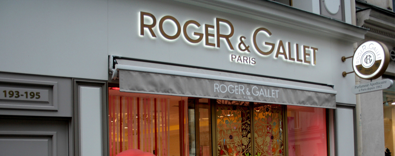
Roger & Gallet
Logo design. Drawing and typography.
The Roger & Gallet corporate logo resulted from the brand's desire for a new horizontal signature to ensure better visibility in retail outlets and advertising.
The original lettering was very effective at conveying the personality of the brand. The challenge was to make it look contemporary while retaining its historic typeface.
The letters were redesigned with greater tension, new spacing and a careful use of weights. The new horizontal signature ensures the design elements have great presence, even in small formats.
Roger & Gallet
Brand identity evolution.
The original lettering was very effective at conveying the personality of the brand. The challenge was to make it look contemporary while retaining its historic typeface.
The letters were redesigned with greater tension, new spacing and careful use of weight. The new horizontal signature ensures the design elements have great presence, even in small formats.

Roger & Gallet
Roger & Gallet flagship on 195 rue Saint-Honoré in the 1st arrondissement, in Paris.
