Lejay
Packaging renovation. Blackcurrant liqueur.
Our aim was to express the gourmet tradition of this historic and iconic product made by Lejay since 1841.
The blackcurrant liqueur was redesigned as a priority, before the rest of the range. The new packaging displays the new logo on each component of the packaging, more specifically as a signature on the label, in the tradition of fine liqueurs.
The materials, colors, graphics and illustrations were all made more sophisticated and modern, without losing their evocative power.
Lejay
Packaging identity evolution.
We took a jay from an old engraving and redrew it, perched on a branch.
The bird sits above the brand name which is designed in a typeface typical of the 19th century, its serifs evoking the claws of the little bird. The jay is a playful reference to the brand (Lejay) and a symbol of the natural world.
It has replaced the cryptic symbol of the "legendary monk" who was originally depicted on the liqueur and crème bottles. This little-known monk was in fact a reference to Abbot Bailly de Montaran who wrote The Admirable Properties of the Blackcurrant in 1712, an essay which may have inspired Auguste-Denis Lagoute to create his famous crème de cassis.

Lejay
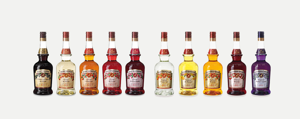
Packaging renovation. Fruit creams range.
The international version of the crème de fruit range is based on the crème de cassis format and available in a variety of flavors.
