Moët & Chandon
Packaging design.
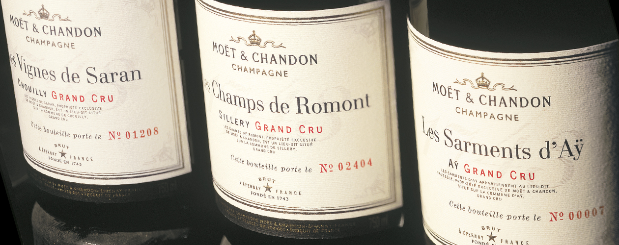
The brand wanted to promote the wine knowledge and growing expertise of the champagne house by releasing a special edition of Grands Crus.
Replicating the conventions of fine Bordeaux wines, the labels express the terroir in an authentic rather than festive way, without any loss of stature thanks to sophisticated detailing and the numbering of the bottles.

Moët & Chandon
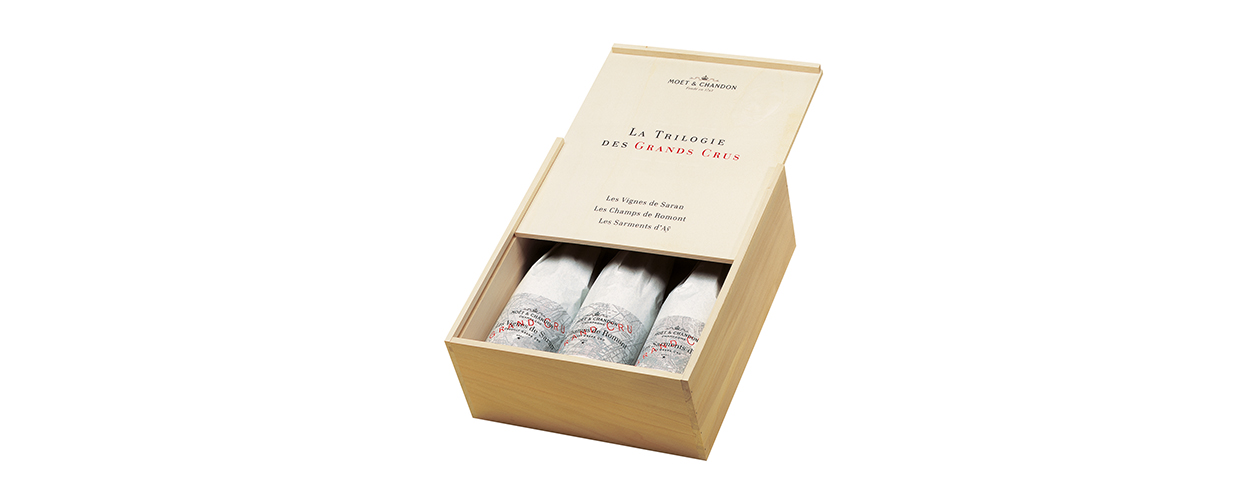
Packaging design. Silk wrapping paper.
A map of the three Grands Crus is reproduced on the silk wrapping paper.

Moët & Chandon
Packaging design. Wooden case.
The Roman numeral III is embossed on the wooden case, a discreet mark to denote a trilogy of fine wines.