Guerlain
Logo design. Typography design.
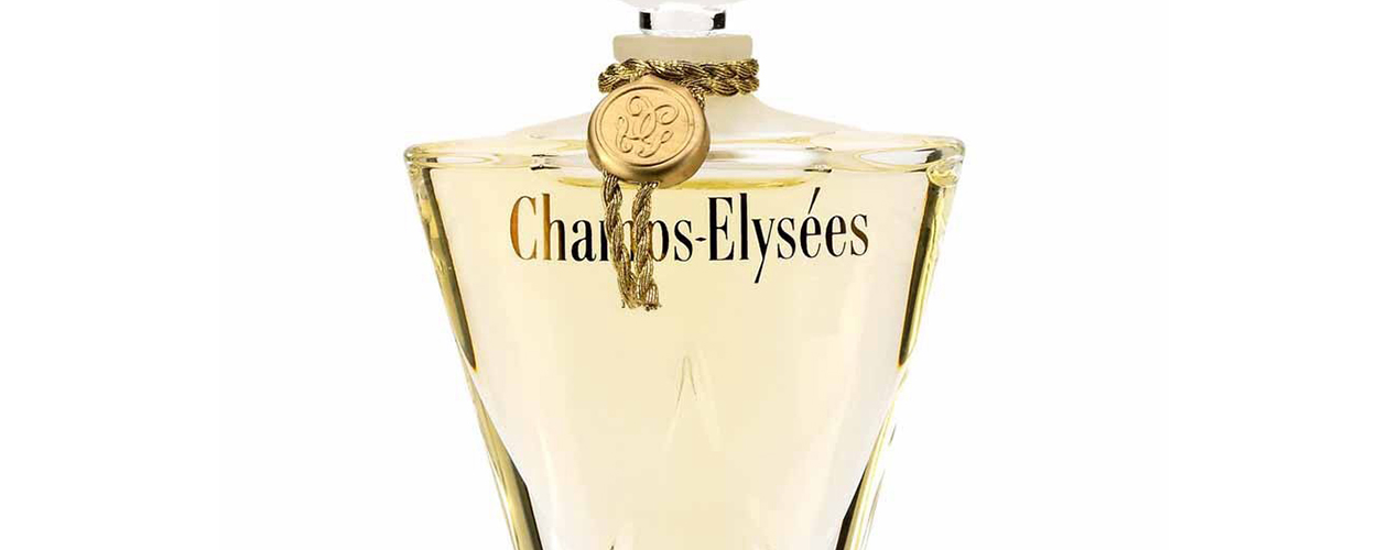
Using the bottle as his starting point, Pierre created a name to epitomise Paris featuring elongated lettering, heavy downstrokes and fine upstrokes similar to the Didot type, a font synonymous with sophistication and femininity.
The visual diagonal between the leg of the y and the acute accent is particularly striking.
Commissioned by Agence Raison Pure.
Guerlain
Logo design. Typography design.