Champagne Henriot
Packaging identity. The range.
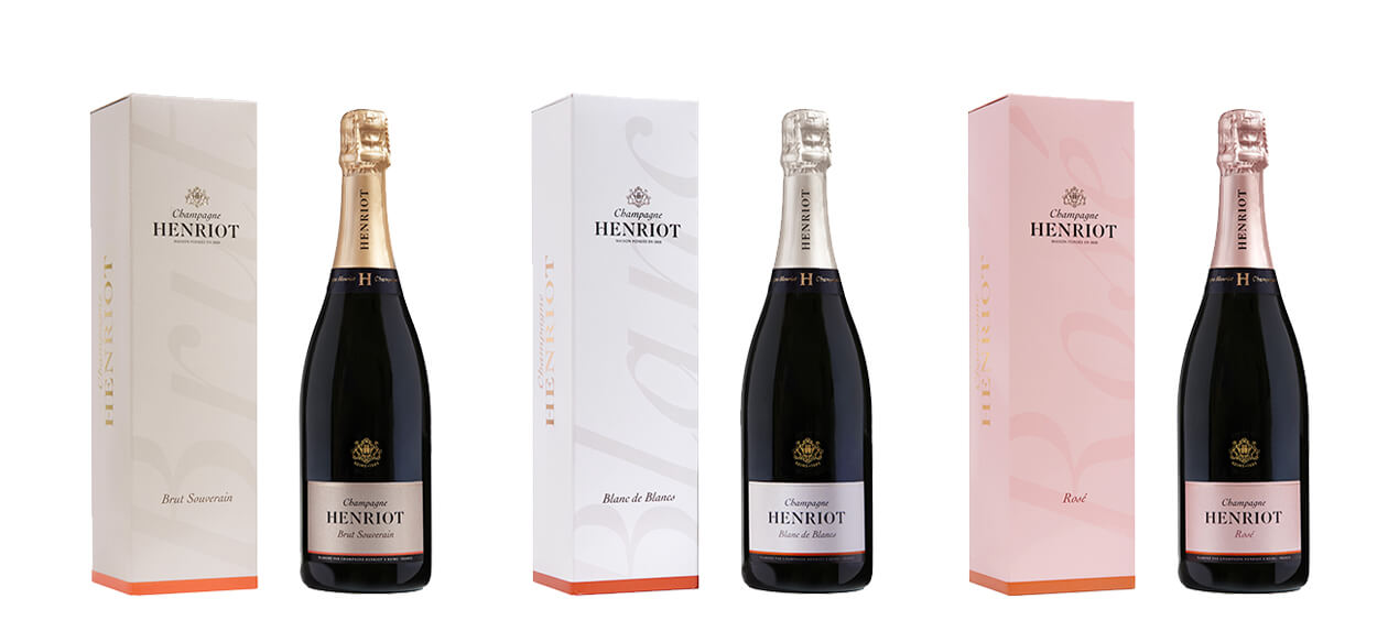
Champagne Henriot's classic range has been completely renovated to increase its perceived quality and to bring more status and culture to an iconic Champagne brand.
Through this renewal, we had to restore presence to the brand and bring it back to light.
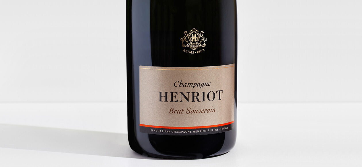
Champagne Henriot's packaging was already quite singular in its form: the very minimalist label, close to a business card size, and the coat of arms in powdered gold on a transparent label gave the bottle a recognizable silhouette. We wanted to keep this silhouette, except for the cap that did not flatter the shape of the bottle, and we reviewed all the proportions, the quality of the signs and choice of colors.
The major change comes on the colors of the standard-bearer of the brand, the Brut Souverain. Previously dressed in a cold gray, urban and not qualitative, we sought to bring more "taste" to its packaging by significantly warming the gray which hue is now more natural. To introduce an element that brings energy, light and modernity to the whole, we have also introduced a brick-colored base that responds to the elegance and stability of gray. This brick tint, inspired by the house Les Aulnois owned by Champagne Henriot, also brings its light touch to other references.
The colors of the Rosé have also been revised, to evolve towards warmer, natural, less acid and chemical hues. The Blanc de Blancs also saw a change in the color of its cap which, if it still looks silvery, has been warmed with a little gold.
Finally, the cap and the collar have been revised to better accompany the shape of the bottle and make it more elegant. The black and straight collar protects the bottle like a choker and features the new chiseled monogram of the brand as a jewel. The collar is no longer silent.
Champagne Henriot
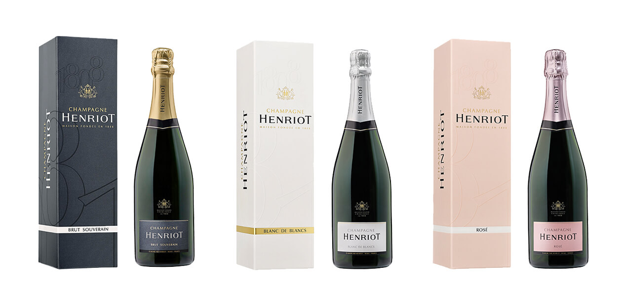
Packaging identity. Before/after
Champagne Henriot's classic range has been completely renovated to increase its perceived quality and to bring more status and culture to an iconic Champagne brand.
Through this renewal, we had to restore presence to the brand and return make it brighter.
Champagne Henriot's packaging was already quite singular in its form: the very minimalist label, close to a business card size, and the coat of arms in powdered gold on a transparent label gave the bottle a recognizable silhouette. We wanted to keep this silhouette, except for the cap that did not flatter the shape of the bottle, and we reviewed all the proportions, the quality of the signs and choice of colors.
The major change comes on the colors of the standard-bearer of the brand, the Brut Souverain. Previously dressed in a cold gray, urban and not qualitative, we sought to bring more "taste" to its packaging by significantly warming the gray which hue is now more natural. To introduce an element that brings energy, light and modernity to the whole, we have also introduced a brick-colored base that responds to the elegance and stability of gray. This brick tint, inspired by the house Les Aulnois owned by Champagne Henriot, also brings its light touch to other references.
The colors of the Rosé have also been revised, to evolve towards warmer, natural, less acid and chemical hues. The Blanc de Blancs also saw a change in the color of its cap which, if it still looks silvery, has been warmed with a little gold.
Finally, the cap and the collar have been revised to better accompany the shape of the bottle and make it more elegant. The black and straight collar protects the bottle like a choker and features the new chiseled monogram of the brand as a jewel. The collar is no longer silent.

Champagne Henriot
Packaging identity. The Blanc de Blancs.
In addition to the introduction of new signs that ennoble the packaging while preserving its recognizable character for the faithful amateurs of Champagne Henriot, the Blanc de Blancs has only seen the color of its cap warm up.

Champagne Henriot
Packaging identity. Detail from the Blanc de Blancs label.
The label of Champagne Henriot that existed before the renovation had the singularity of being very bare, which was compensated by the crest that came in gold on a transparent label to crown it.
We have kept these recognizable characteristics, but we have changed all the proportions. The color of the label has not changed, apart from the brand's new brick-colored base.

Champagne Henriot
Packaging identity. The Brut Souverain.
The transformation of the Brut Souverain is complete, its colors have been completely redesigned to gain in naturalness, elegance and light.

Champagne Henriot
Packaging identity. Detail from the Brut Souverain label.
The brick-colored base that refers to the facade of the Les Aulnois house in Pierry, energizes the warm gray that is part of the identity of the Brut Souverain, but also part of the brand's color identity.

Champagne Henriot
Packaging identity. The Rosé.
The colors of the Rosé have evolved towards more elegance and "taste". The headdress warmed up to lose its acid side, candy. The color of the box is densified to find presence and substance.

