Champagne Henriot
Logo design. Drawing and typography.
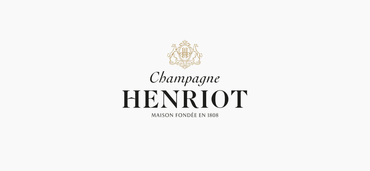
In 2017, the signature and emblem of Champagne Henriot evolve to affirm the essence of the House's craftsmanship, and its vocation to reveal the best of Champagne.
The main idea was to infuse status and culture to an emblematic Champagne brand, to give it back its presence and to bring it back to light.
The emblem of the House, whose function is to recall the origins, is now adorned with the monogram of its founder Apolline Henriot which gives it full legitimacy and a wealth of new evocations.
The general silhouette of the emblem, transformed by greyhounds with a haughtier and more athletic port, has been enriched with an ornate frame to evoke the typical nineteenth-century splendor in which the House was born.
The graphics of the name were given more corpulence and shine.
Champagne Henriot
Brand identity evolution.
In the coat of arms of the House, the major change occurs at the location of the monogram: that of Apolline Henriot, founder of the house, now appears in the shield.
This typical nineteenth century monogram evokes a voluptuous and baroque opulence, and imparts a more authentic character to the emblem. The structuring frame of the emblem, the coat, has been redesigned to evoke the splendor of a chandelier or the shape of a lyre. The silhouette of the emblem now evokes an "Opera Garnier"Second Empire spirit, rather than a mounted piece. The greyhounds, noble animals symbols of loyalty and luck, have been redrawn from archive pieces of the house, to find a more adult and athletic character.
We added more "flesh" to the letter of the name Henriot and removed the big capitals on the H and the T which gave the whole a useless emphatic character. The base letter comes from a classic character, chosen for its corpulence and brilliance. The letter has been elongated and fattened for greater presence.
The word "Champagne" is now written in a script, which evokes the handwritten letter and the hand of man. It was necessary to give this word that qualifies the House and the quality of its wines a more expressive and personal dimension. It brings the word Champagne a more unctuous, sensual, brilliant silhouette, and adds a dimension of pleasure which was previously absent from it. We are now in the personal and authentic trace, the roundness of which evokes the gesture of the hand, the vital breath, and a rhythm, a movement, which contrasts with an immobile identity of commercial enterprise.
The mention "House founded in 1808" has been reworked in an extremely readable character with its micro-serifs (letter endings) that give it a very contemporary look without losing historical density.

Champagne Henriot
Design of the monogram.
The initial of Henriot, used in a perforated version, meets a need to sign in a contemporary and concise way.
It comes from the same design as the H from the logo, but has been reworked to live alone and gain in preciousness, with the fine hatching and shadows on the barrels of the letter, which recall a style typical of 19th Century personal stationary.
