Bouchard Père et Fils
Logo design. Drawing and typography.
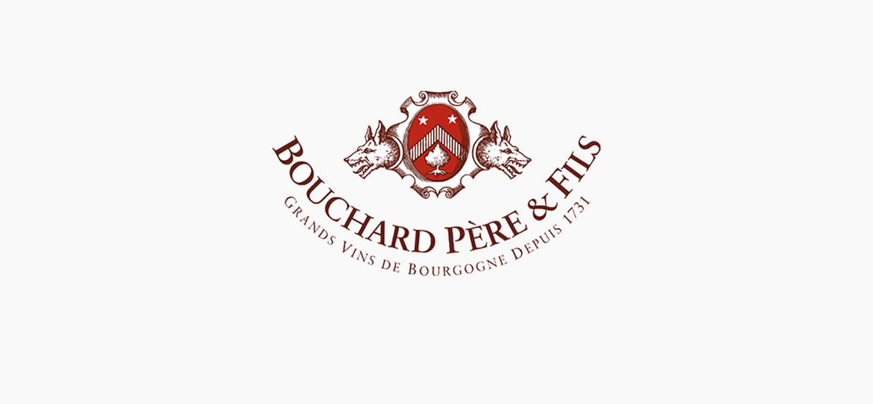
In 2017, the logo, emblem and packaging of Bouchard Père & Fils wines were redesigned to convey the prominent status of the Burgundy winemaker, while asserting their values of excellence and generosity.
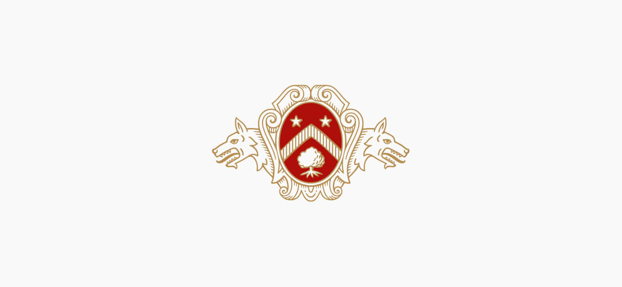
Given a "facelift" for greater contemporaneity, the two iconic wolves are now less aggressive and have become benevolent symbols, transformed from hunting trophies to guardians of the great house.
The coat of arms has been given a soft, curving shape to convey the welcoming nature of the company and the concepts of pleasure and generosity.
The graphics of the Bouchard Père & Fils logo have been straightened and designed in a typeface that is both robust and sparkling, with a distinctive identity inspired by the historic signatures of the house.
Bouchard Père et Fils
Brand identity evolution.
The oval shape was redesigned so that its appearance suggests a cameo rather than an egg.
The oak tree symbolizes power and posterity and was redesigned to make its foliage and roots more harmonious.
The red coloring was made denser, warmer and darker to create a sense of depth and grandeur.
Before, the mantle looked either like an old parchment or the hide of a dead animal. Our aim was to give the coat of arms a less rustic and aggressive appearance, making it more architectural, so that it acts as a kind of pediment with soft, curved and welcoming shapes.
The wolves have been given a more heraldic and less naturalistic appearance. Originally displaying an aggressive posture (ears flattened, eyes narrowed), they now stand on guard (ears straightened, eyes open). We included the furry upper chest of the wolves to replace the two cut-off heads, giving them the role of guardians rather than hunting trophies.
The Bouchard Père & Fils name was completely redesigned from an archive typeface, from which we took the A with its diamond point crossbar, and the unique ampersand (& sign) with its characteristic little beak.
Bouchard Père et Fils
Redesign of the coat of arms.
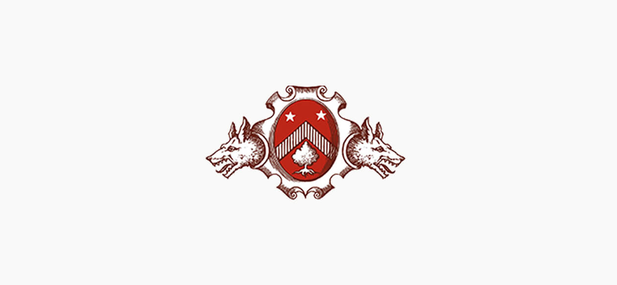
The oval shape was redesigned so that its appearance suggests a cameo rather than an egg.
The oak tree symbolizes power and posterity and was redesigned to make its foliage and roots more harmonious.
The red coloring was made denser, warmer and darker to create a sense of depth and grandeur.
Before, the mantle looked either like an old parchment or the hide of a dead animal. Our aim was to give the coat of arms a less rustic and aggressive appearance, making it more architectural, so that it acts as a kind of pediment with soft, curved and welcoming shapes.
The wolves have been given a more heraldic and less naturalistic appearance. Originally displaying an aggressive posture (ears flattened, eyes narrowed), they now stand on guard (ears straightened, eyes open). We included the furry upper chest of the wolves to replace the two cut-off heads, giving them the role of guardians rather than hunting trophies.
Bouchard Père et Fils
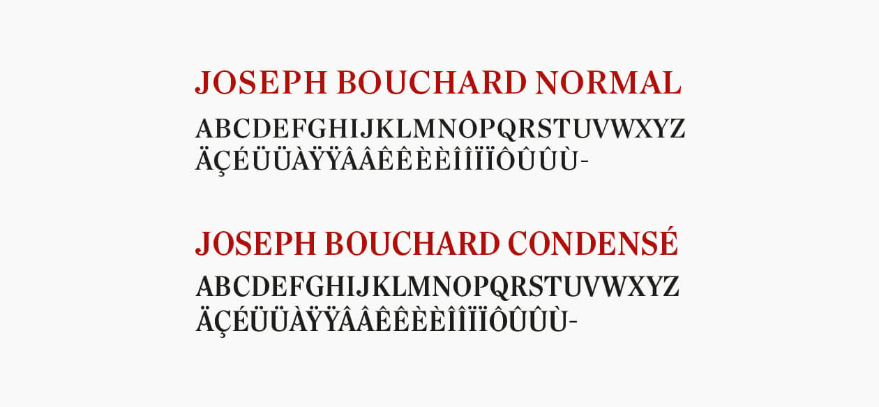
Design of an exclusive typeface. Normal and condensed version.
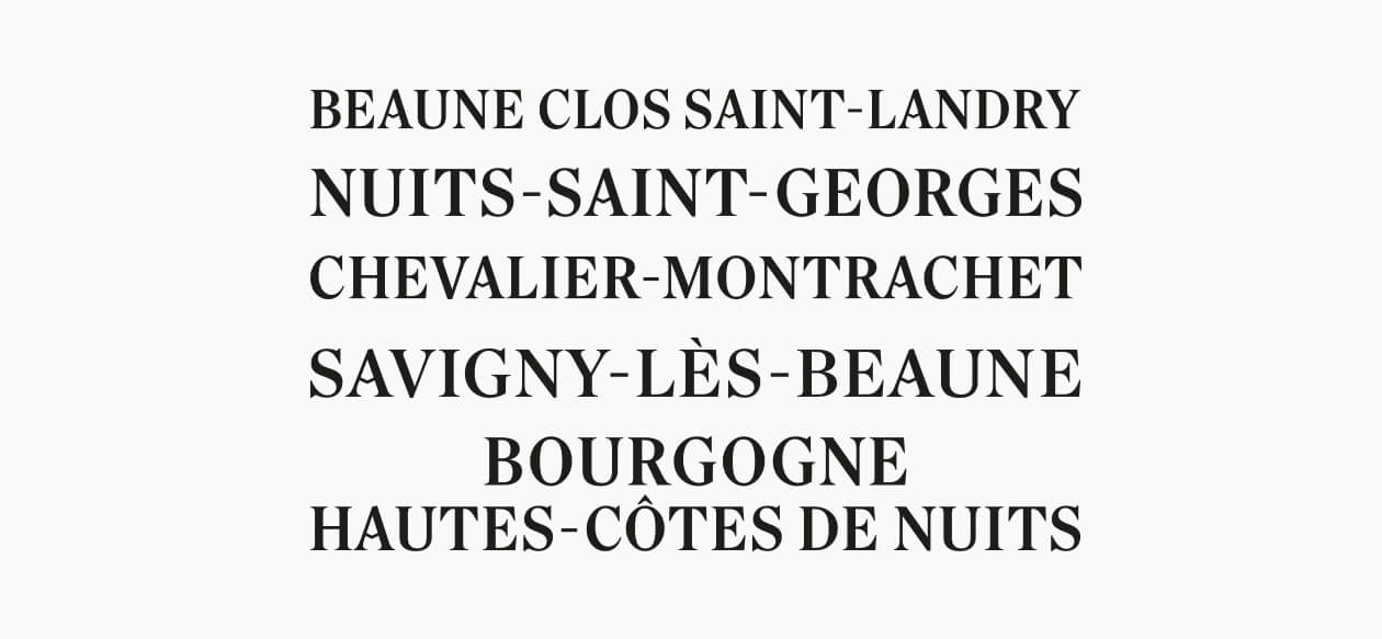
The typeface Joseph Bouchard is an exclusive character designed for Bouchard Père & Fils to personalize the appellations of its wines on the labels.
Inspired by the Bouchard Père & Fils logotype, itself drawn from typographic archives, it is used in two versions: Normal and Condensed.
Bouchard Père et Fils
Design of an exclusive typeface. Examples of appellations.
