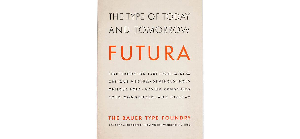
Minimalism is a movement that has tremendously influenced design, from its ancestor the Bauhaus movement that aimed at defining modernity, to today’s trend around flat design, geometrical shapes and sans serif typefaces. But the current trend sometimes amalgamates the credo of a movement that promoted designs of essential shapes which only purpose was to reveal the function of the object, with a gratuitous formal economy that impoverishes creation. Simple is beautiful, ornate is beautiful, as long as it all makes sense.
The Bauhaus movement was about functionalism and truth to materials, and one of its main leaders, architect Mies van der Rohe theorized principles that still resonate today, and famous quotes that remain guiding principles for designers such as “less is more” or “god is the details”. Bauhaus thus inspired minimalism that is looking for the most immediate vocabulary to transmit a message in the densest possible way.
Why is minimalism important in designing brand identities?
An expression we use in our work is “visual ecology”: it’s about finding the treatment that’s the most transparent possible to reveal the brand only, avoiding noise and stylistic clichés. If the design draws attention to itself instead of letting the brand shine, then it’s a problem. It should only give meaning to read without one having to decrypt it.
In graphic design, just like in other fields of design, minimalism well used is not about being bland nor basic, and it’s not about being aesthetically minimal.
It’s about functional minimalism – all elements being essential to an ensemble, having a purpose and serving it well. The style chosen to express the singularity of a brand, its character, history and values can greatly change in shapes, proportions and colors but if the final design is functionally minimal, if it’s pure meaning and no decorative gesticulation, that design can be time-proof.