Champagne Henriot
Packaging design.
The prestige cuvée of Champagne Henriot, formerly called Cuvée des Enchanteleurs, was the last missing link in the transformation of its wines' style by cellar master Laurent Fresnet.
The new signature aimed at showing more freshness, delicacy and elegance and was only revealed in the prestige cuvée with the 2005 vintage, after spending 12 years in the cellars of the house. The Cuvée des Enchanteleurs became the Cuvée Hemera, a reference to the Greek goddess of light.
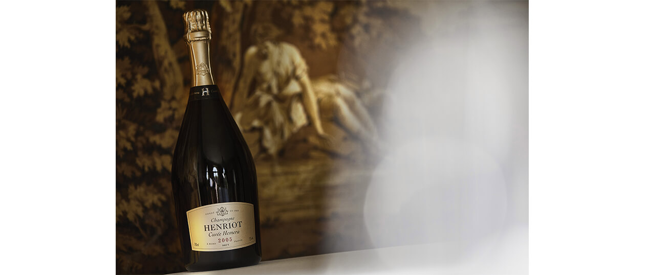
The shape of the label has been revised to flatter the singular shape of the bottle, and to introduce a filiation with the classic range, we took its rectangular shape as a starting point. From there, we curved its sides giving an impression of "puffed out" chest, and a more corpulent look.
The name of the Cuvée Hemera is written in a script that evokes handwriting and the trace of man - evocations that reinforce the particular dimension of this prestigious vintage. In this same idea, the vintage now comes in red, and in a character reminiscent of numbered lot marking.
Champagne Henriot
Packaging identity evolution.
The shape of the label has been revised to flatter the singular shape of the bottle, and to introduce a filiation with the classic range, we took its rectangular shape as a starting point.
From there, we curved its sides giving an impression of "puffed out" chest, and a more corpulent look.
The name of the Cuvée Hemera is written in a script that evokes handwriting and the trace of man - evocations that reinforce the particular dimension of this prestigious vintage. In this same idea, the vintage now comes in red, and in a character reminiscent of numbered lot marking.
The color of the cap, a very white gold, has been warmed to gain in opulence and softness. The crest is embossed in the thick tin foil, which gives it a sensuous appearance.
The name Henriot that formerly appeared on the cap, was replaced by a more discreet monogram which now adorns the collar. The collar is thus no longer mute, as it is decorated with the monogram of the house and the name of the cuvée. Its shape was redesigned for a more contemporary "choker" silhouette, and its matte paper contrasts with the shine of the tin foil.

Champagne Henriot
Packaging design.
The color of the cap, a very white gold, has been warmed to gain in opulence and softness.
The crest is embossed in the thick tin foil, which gives it a sensuous appearance.
The name Henriot that formerly appeared on the cap, was replaced by a more discreet monogram which now adorns the collar. The collar is thus no longer mute, as it is decorated with the monogram of the house and the name of the cuvée. Its shape was redesigned for a more contemporary "choker" silhouette, and its matte paper contrasts with the shine of the tin foil.

Champagne Henriot
Packaging design.
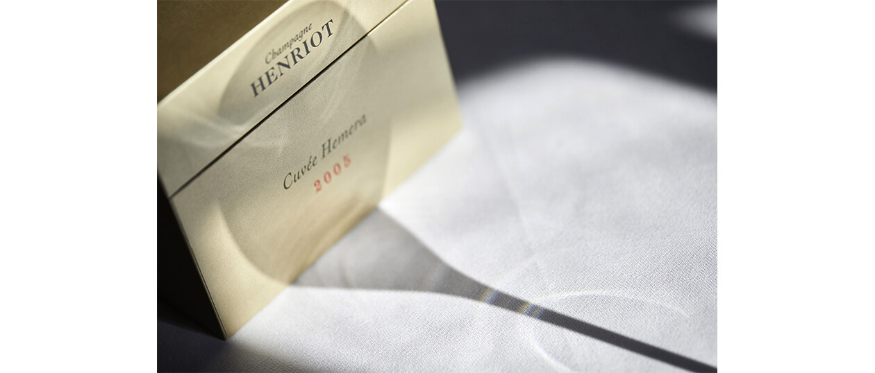
The wooden coffret, dressed with the golden color of Hemera's label, is closed by a leather strap which is stamped with the iconic H.

