Sillages Paris
Logo design. Typography design.
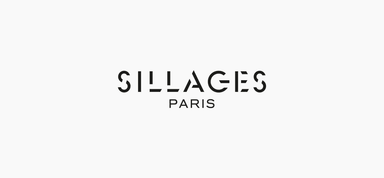
The logo of Sillages Paris, a new niche perfume house, was designed to suggest both strength and permanence, the name of an institution and the ephemeral nature of a perfume sillage.
The design of the logo was inspired by the perfect proportions of the Roman capital, a soft and full type embodying harmony and humanity. The cutouts in the lettering give the name an unusual and radical outline, alternating between shade and light as it appears and disappears.

Sillages Paris
Design of the monogram.
To create a concise and memorable logo symbol, we extracted the S which starts and ends the name Sillages, turned it on its side and symmetrically inverted it.
This S, which is no longer really an S, becomes a mysterious sign capable of suggesting many things: the infinite, the link in a chain, a rallying sign, and so on.

Sillages Paris
Label design.
Each perfume is unique and aims to project no image or archetype into the mind of the client who chooses it as their own.
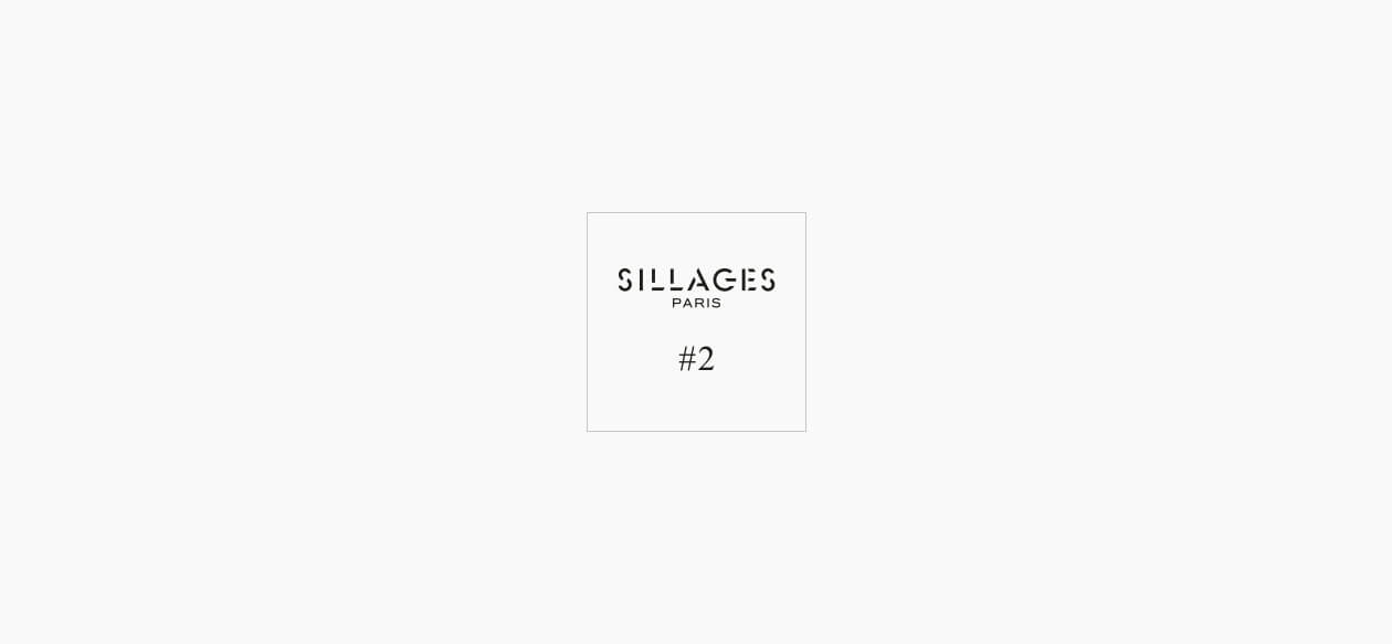
The fragrances are therefore named with a simple number (the hash sign evoking both the hashtag but also the number sign) in a universal, elegant yet absolutely transparent type.