Maisons & Domaines Henriot
Logo design. Design and typography.
In 2017, Maisons & Domaines Henriot started the process of updating its identity to assert its special positioning as a family-run group committed to excellence, transmission of know-how and the durability of its brands.
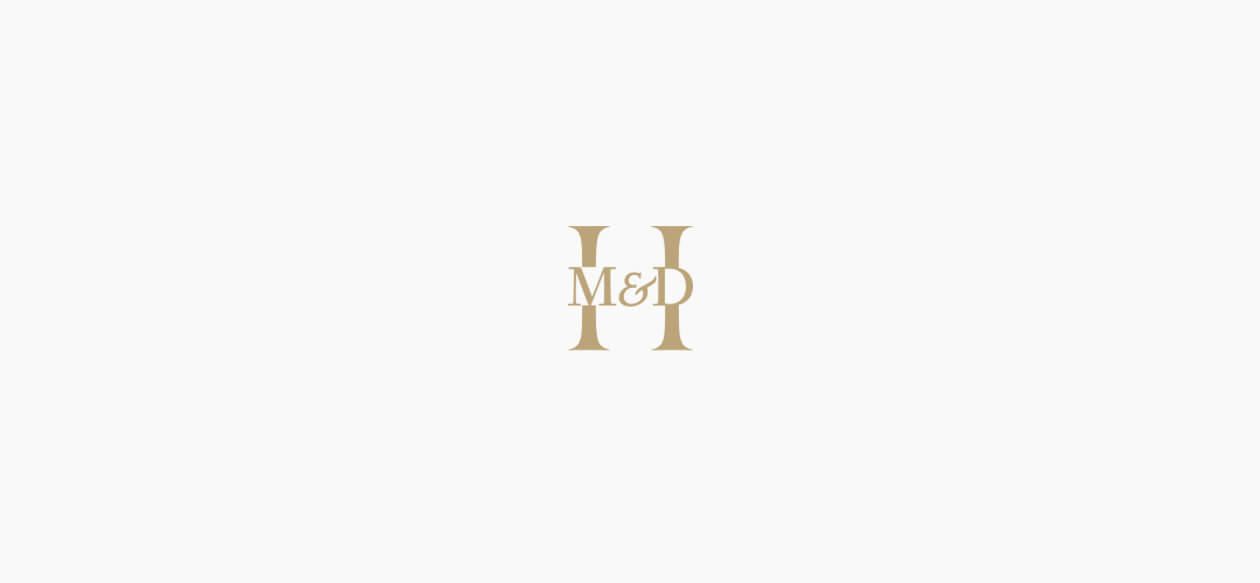
In 2017, a monogram was added to the Maisons & Domaines Henriot logo, consisting of an H for the Henriot family and the letters M&D which make the H stronger. Symbolically, the Maisons & Domaines arm is the strength behind the Henriot group, reinforcing its structure, while the pillars of the H, as if anchored in the ground, are reminiscent of foundations.
The graphic design of the name evokes an architectural pediment, with a typeface that is both human and robust.
Maisons & Domaines Henriot
Brand identity evolution.
In 2017, a monogram was added to the Maisons & Domaines Henriot logo, consisting of an H for the Henriot family and the letters M&D which make the H stronger.
Symbolically, the Maisons & Domaines arm is the strength behind the Henriot group, reinforcing its structure, while the pillars of the H, as if anchored in the ground, are reminiscent of foundations.
The graphic design of the name evokes an architectural pediment, with a typeface that is both human and robust.

Maisons & Domaines Henriot
Design of the monogram.
The emblem consists of an H in the same type as the company name.
The letters M and D which replace the crossbar of the H and represent the reinforcement of its structure, are taken from another typeface which makes the overall effect more harmonious, and allows these letters to sit neatly in the extensions of the "pillars" of the H.
The ampersand has been reworked from a third typeface, chosen for its unusual design and strong anthropomorphic feel, an almost human outline, or possibly a plant with its light and flowing terminal, and in either case with a beautifully flowing movement.
The emblem has a deliberately architectural dimension: the H is in essence an architectural letter, representing a house or a door. The crossbar of the H which strengthens the overall structure is made up of Maisons & Domaines which act as a bridge.
The stems of the H suggest pillars which support the structure and express the family dimension.
The overall effect of the monogram is one of delicacy, its finely worked appearance reminiscent of goldsmithery.
