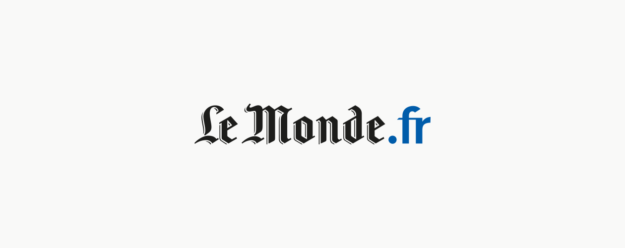
LeMonde.fr
Design of the logo's web extension. Typography design.
Prestigious French newspaper Le Monde required a logo specific to its website. The challenge laid in the fact that the newspaper's gothic typography had very "old world" connotations, and did not convey the concept of modernity inherent to the web.
We were asked to add a ".fr" suffix which was to be much more than a simple juxtaposition, and instead a design element capable of dialoguing with the original logo, while also ensuring consistency of the whole. The hybrid type accentuates the verticality of the lettering for maximum compatibility with the spacing and blackness of the iconic gothic.