Dom Pérignon
Packaging renovation.
When the Dom Perignon brand was made independent from the house of Moët & Chandon, we were asked to make subtle changes to the iconic label.
This was a two-stage process: the word "cuvée" was removed to emphasize Dom Perignon as the brand name ; and Moët & Chandon was later removed from the label's frontispiece.
All of the writing and engraving was redesigned. The colors changed from a dry leaf's shade to a "copper" shade for the label, and from an "earth" shade to black for the foil.
Dom Pérignon
Label evolution.
Changes were made in two phases, with the gradual disappearance of the name Moët & Chandon from the top of the label.
The different typefaces were streamlined. The vine branches and the star were meticulously redesigned.
The wording "Moët et Chandon" was removed from the top of the label. This area now contains the name of the monk who supposedly invented champagne, followed by the date he took up his post at Hautvillers Abbey.

Dom Pérignon
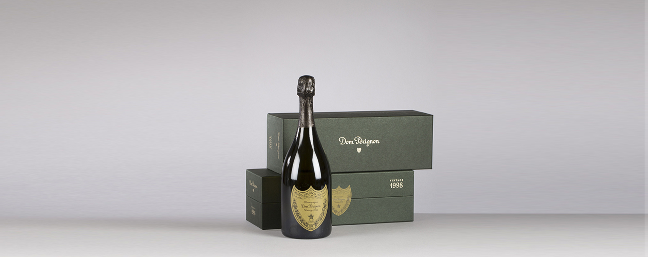
Packaging renovation. Bottle and boxes.
We put the new brand's logo forward, along with the iconic Dom Perignon label, which silhouette is now used as an emblem.

Dom Pérignon
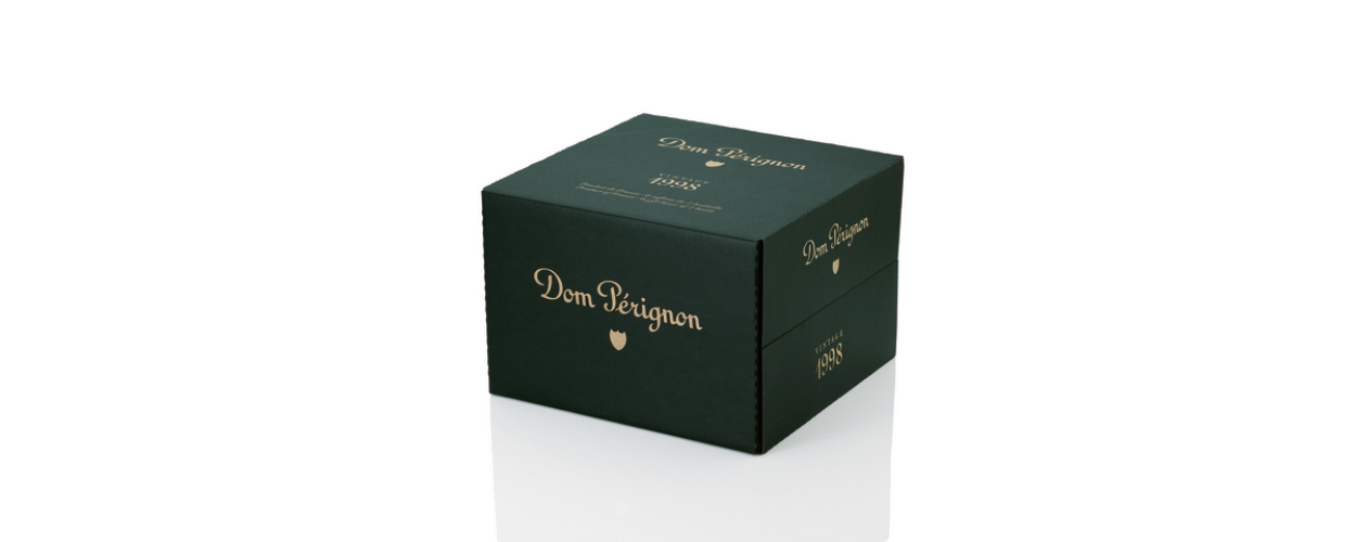
Packaging renovation. Cases.
The cases are dressed with the new logo and brand colors, as they are an important media for the new brand, being often used as display elements.

