Lejay
Packaging design.
Our mission for this new product was to facilitate a new phase in the international expansion of the brand by establishing Lejay crème de cassis as a premium go-to product in American bars.
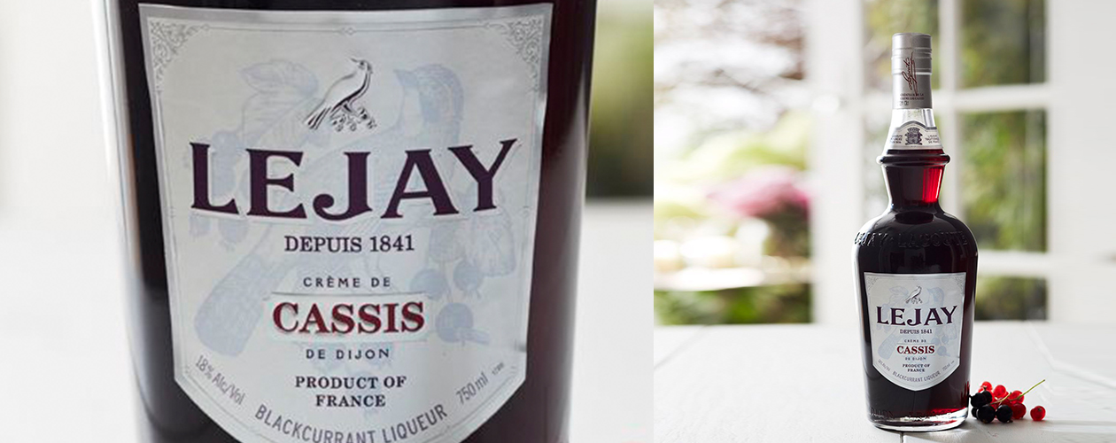
As a natural continuation of its history, we redesigned the bottle to give it a vintage feel inspired by the French "guinguettes" (open-air cafés) of the 1930s. We adapted the volume of a historic bottle, and shaped the label like a coat of arms, echoing the design of the neck label.
The background of the label features an old reworked engraving taken from the brand's archives and framed with a decorative frieze of 19th-century inspiration. The coat of arms of the city of Dijon anchors the brand to its historic and regional heritage.
The satin-finish paper combined with silver gilding creates an exquisite and luminous effect.

Lejay
Packaging design.
Lejay Original was originally intended solely for the American market, where the brand wanted to establish itself with a more premium positioning than in Europe.
The success of the reference quickly made it a flagship for the brand, before becoming the very center of its product strategy.